Mushroom plots to visualise gain and loss on a phylogenetic tree
Understanding when and how traits are gained or lost is a key aspect of studying the evolutionary history of different lineages.
For instance, modelling the gains and losses of genes across phylogenetic trees is frequently performed as part of evolutionary analyses using software such as CAFE5. How best to visualise these changes across the tree is not necessarily obvious.
Basic text-based visualisation
I usually see gene gains and losses simply plotted as numerical values on each branch of a tree.
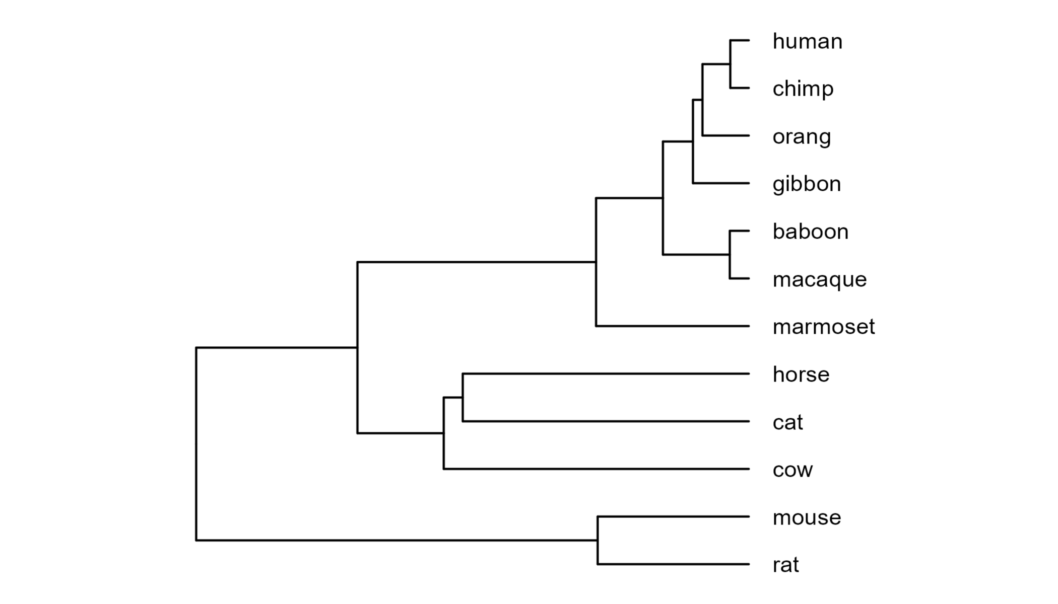
Here I’m using the example dataset provided on the CAFE5
github. Let’s take a look at the
underlying phylogeny by plotting it with ggtree.
library(ape)
library(ggtree)
library(tgutil)

phy <- read.tree("mammals_tree.txt")

gg.tree <- ggtree(phy) +
  xlim(NA, 160) +
  geom_tiplab(offset=5) +
  ggpreview(width=5, height=4)
Next we can read in a CAFE5 output table which provides the number of genes that are gained or lost for each node of the tree.
#Read in gene gain and loss data
df <- read.csv("Base_clade_results.txt", sep="\t")

head(df)
##   X.Taxon_ID Increase Decrease
## 1    cow<14>      600      594
## 2       <18>      222      288
## 3       <21>       27      110
## 4    cat<11>      703      820
## 5  horse<10>      370      880
## 6       <13>       95      155
You can see that CAFE5 assigns each node a taxon ID, but these don’t
correspond to the node numbers that ggtree uses when it plots trees,
so we need to do a bit of data wrangling to match these up.
#Read in the first tree from the CAFE5 ancestral state reconstruction output
cafe.phy <- read.nexus("Base_asr.tre")[[1]]

#Plot tree with ggtree
gg.cafe.tree <- ggtree(cafe.phy)

#Match tree labels and add column with the ggtree node
df$node <- gg.cafe.tree$data$node[
  match(df$X.Taxon_ID, sub("_.*", "", gg.cafe.tree$data$label))
  ]

head(df)
##   X.Taxon_ID Increase Decrease node
## 1    cow<14>      600      594    3
## 2       <18>      222      288   17
## 3       <21>       27      110   14
## 4    cat<11>      703      820    1
## 5  horse<10>      370      880    2
## 6       <13>       95      155   18
We can then plot the gene loss/gain values as text on branches, as is common practice for this kind of data.
library(dplyr)
library(tidyr)

#Format the data for plotting on the tree
df2 <- df %>%
  #Put the increases and decreases on separate rows
  pivot_longer(-c(node, X.Taxon_ID), names_to="direction") %>%
  #Set the order for plots
  mutate(direction=factor(direction, levels=c("Increase", "Decrease"))) %>%
  #Add the tree data to know where to plot the labels
  left_join(gg.tree$data, by="node")

gg.tree.text <- gg.tree +
  #Add gain/loss labels to each branch
  geom_nodelab(data=df2,
               aes(x=branch, y=y, colour=direction,
                   #Add a + or - to make the increase/decrease more explicit
                   label=ifelse(direction == "Increase",
                                paste0("+", value),
                                paste0("-", value)),
                   #Shift the increases above the branch and decreases below
                   vjust=ifelse(direction == "Increase",
                                -0.3,
                                1.3)),
               node="all", #Include labels for both tips and internal nodes
               size=2,
               show.legend=FALSE) +
  ggpreview(width=5, height=4)
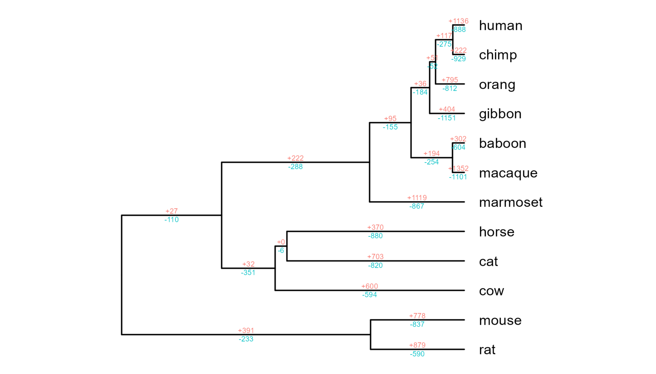
There’s nothing wrong with this kind of plot, but I personally find it quite hard to spot patterns across the phylogeny. I was keen to try and come up with a better visual solution.
Mushrooms to the rescue
This gave me the idea of using these guys:

The formal name for this kind of plot seems to be a ‘semicircular proportional area plot’. However, I’m sure you’ll agree that ‘mushroom plot’ is more pleasing (although as somebody who researches fungi I am surely biased!)
In brief, this kind of plot involves two semicircles which can each vary in their size to give an idea of relative difference in magnitude. It’s essentially a circularised bar plot, which I think is a bit neater to plot on phylogeny nodes compared to a normal bar plot.
Fortunately, adding these to our tree is remarkably simple thanks to two
unicode characters for an upper and lower semicircle: \u2BCA (⯊) and
\u2BCB (⯋).
gg.tree.mushrooms <- gg.tree +
  #Add points to each node
  geom_point(data=df2,
             aes(x=x, y=y, size=value, colour=direction, shape=direction)) +
  #Set points as semicircle unicodes
  scale_shape_manual(values=c("\u2BCA", "\u2BCB")) +
  scale_size_continuous(breaks=c(1, 100, 500, 1000),
                        range=c(1, 10)) +
  #Format legend
  guides(colour=guide_legend(override.aes=list(size=5)),
         size=guide_legend(override.aes=list(shape="\u2BCA"))) +
  theme(legend.position="inside",
        legend.position.inside=c(.3, .8),
        legend.box="horizontal",
        legend.title=element_blank()) +
  ggpreview(width=5, height=4)
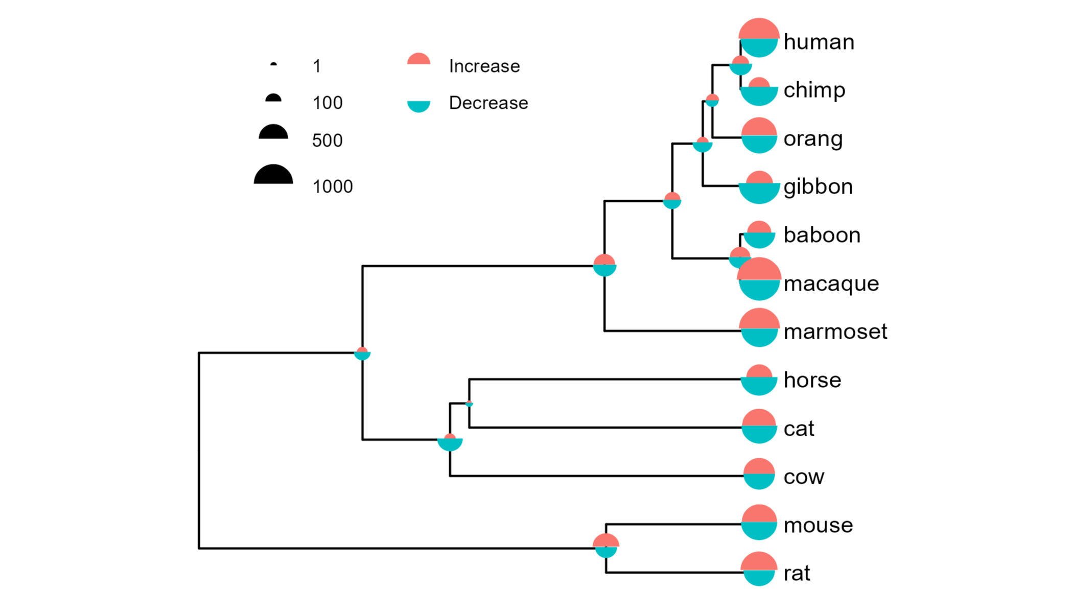
This kind of plot is probably not to everybody’s taste, but compared to the text-based plot above I personally find this much quicker and easier to interpret, both for comparing different nodes and comparing gains and losses for the same node.
I also find it very satisfying that alignment of the two semicircles is intrinsically handled thanks to how the unicode characters are centred.
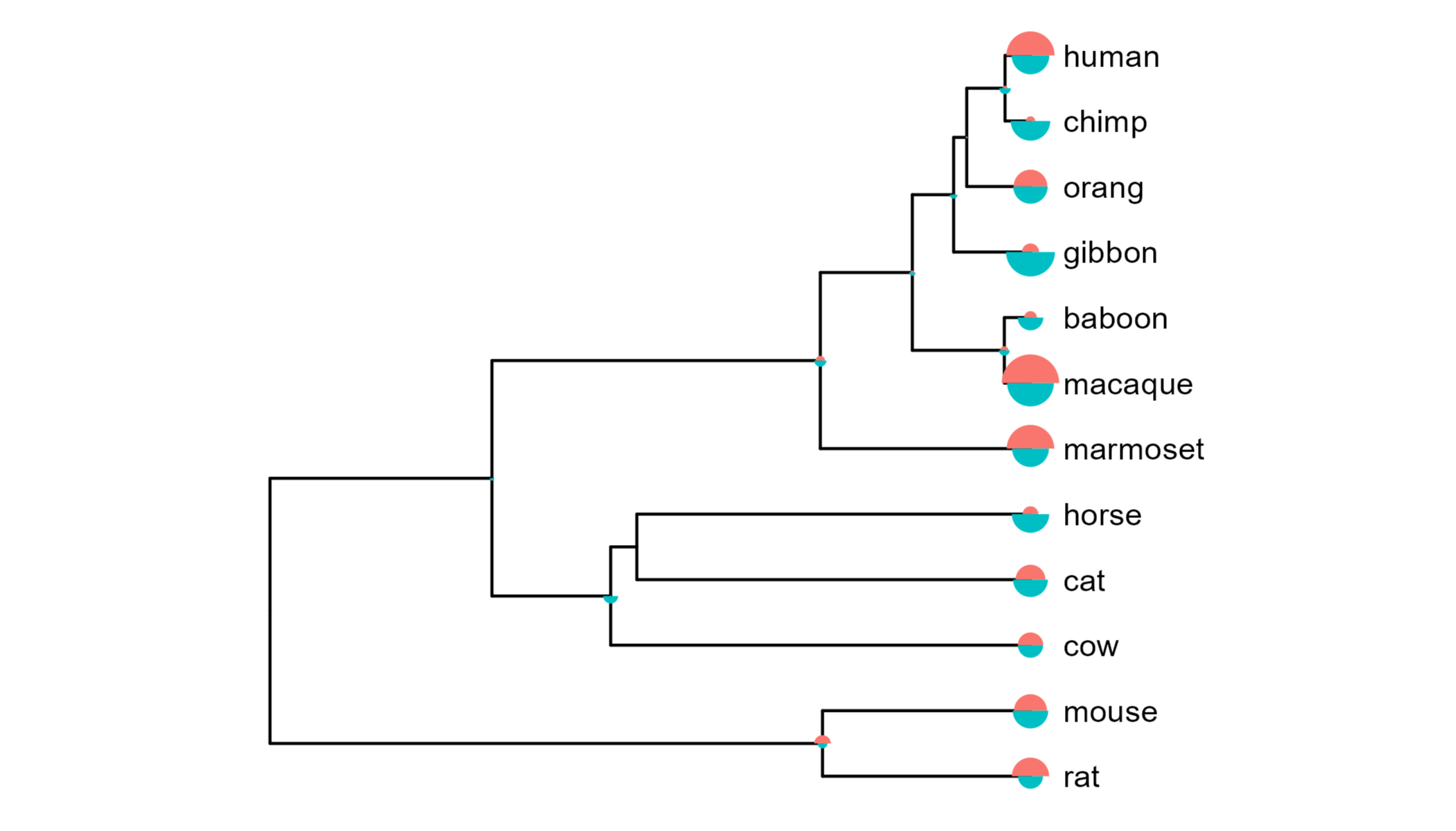
Addendum
Before I came up with the simple solution above, I tried to adapt the
nodepie functionality
in ggtree for plotting pie charts on tree nodes.
This involved first writing a function to plot individual bar plots for
each node and using the coord_polar system to circularise the bar plot
into a mushroom plot, and then using the geom_inset layer to add these
plots to the tree nodes.
While you can see below that this does work, there is no simple way to generate a legend corresponding to the size of the mushrooms. As the scale also appears a little different to the plot above, I wasn’t confident that the relative sizes across nodes were being correctly retained.
Nonetheless, I’ve included this alternative approach here in case this sort of functionality is of use in another context.
#Get the maximum value to scale all mushroom plots to
max.value <- plyr::round_any(max(df2$value), 10, f=ceiling)

#Function to plot gain/loss mushroom for a node
mushroom_plot <- function(data) {
  p <- ggplot(data, aes(x=direction, y=value, fill=direction)) +
    geom_bar(stat="identity", width=1, show.legend=FALSE) +
    scale_y_continuous(expand=c(0,0),
                       limits=c(0, max.value)) +
    coord_polar(theta="x", direction=1,
                #Rotate to have the increase above and decrease below
                start=-90 * pi / 180,
                clip="off") +
    theme_void()
  return(p)
}

#Split dataframe into list of nodes
nodes.list <- df2 %>%
  split(., .$node)

#Make mushrooms plots for each node in list
insets <- lapply(nodes.list, function(df) mushroom_plot(data=df))

#Add mushroom plots to tree
gg.tree.insets <- gg.tree +
  geom_inset(insets, width=0.1, height=0.1) +
  ggpreview(width=5, height=4)
Session details
sessionInfo()
## R version 4.3.1 (2023-06-16 ucrt)
## Platform: x86_64-w64-mingw32/x64 (64-bit)
## Running under: Windows 11 x64 (build 22631)
##
## Matrix products: default
##
##
## locale:
## [1] LC_COLLATE=English_United Kingdom.utf8
## [2] LC_CTYPE=English_United Kingdom.utf8
## [3] LC_MONETARY=English_United Kingdom.utf8
## [4] LC_NUMERIC=C
## [5] LC_TIME=English_United Kingdom.utf8
##
## time zone: Europe/London
## tzcode source: internal
##
## attached base packages:
## [1] stats     graphics  grDevices utils     datasets  methods   base
##
## other attached packages:
## [1] ggplot2_4.0.0 tidyr_1.3.0   dplyr_1.1.3   tgutil_0.1.15 ggtree_3.99.2
## [6] ape_5.8-1
##
## loaded via a namespace (and not attached):
##  [1] yulab.utils_0.2.1.002 rappdirs_0.3.3        utf8_1.2.3
##  [4] generics_0.1.3        ggplotify_0.1.2       lattice_0.21-8
##  [7] digest_0.6.33         magrittr_2.0.3        evaluate_0.24.0
## [10] grid_4.3.1            RColorBrewer_1.1-3    fastmap_1.1.1
## [13] plyr_1.8.9            jsonlite_1.8.7        purrr_1.0.2
## [16] fansi_1.0.5           aplot_0.2.9           scales_1.4.0
## [19] textshaping_0.4.0     lazyeval_0.2.2        cli_3.6.1
## [22] rlang_1.1.4           ggimage_0.3.4         tidytree_0.4.6
## [25] withr_3.0.0           yaml_2.3.8            tools_4.3.1
## [28] parallel_4.3.1        uuid_1.2-0            png_0.1-8
## [31] vctrs_0.6.3           R6_2.5.1              gridGraphics_0.5-1
## [34] magick_2.9.0          lifecycle_1.0.4       fs_1.6.3
## [37] htmlwidgets_1.6.4     ggfun_0.2.0           ragg_1.3.2
## [40] treeio_1.29.1         pkgconfig_2.0.3       pillar_1.9.0
## [43] gtable_0.3.6          glue_1.6.2            Rcpp_1.0.11
## [46] systemfonts_1.3.1     highr_0.11            xfun_0.53
## [49] tibble_3.2.1          tidyselect_1.2.1      rstudioapi_0.16.0
## [52] ggiraph_0.9.1         knitr_1.47            dichromat_2.0-0.1
## [55] farver_2.1.2          htmltools_0.5.8.1     nlme_3.1-162
## [58] patchwork_1.3.2.9000  labeling_0.4.3        rmarkdown_2.27
## [61] compiler_4.3.1        S7_0.2.0