Digging into Asana data from my PhD

Last month I handed in my PhD thesis, the culmination of almost 4 years of work! 🥳
It's the end of an era for me today as I submitted my PhD thesis..! 🍄 Thanks for everything @EsterGaya1 @RJABuggs @theo_llewellyn among many others @KewScience @KewMycology. Excited to start as a postdoc @EarlhamInst in the new year (after I make the most of the holidays!!) pic.twitter.com/AChkBYQgKL
— Rowena Hill (@RowenaCHill) December 21, 2022
In mid 2019 when I was about 6 months into my PhD I realised that I could benefit from using some kind of project management software, and ended up settling on Asana. From then on, I used the platform to track practically every single task I did for the rest of my PhD.
As a result, Asana is a juicy archive of all the work I’ve done throughout almost my entire PhD. Being the data nerd I am, I couldn’t resist digging into it! It was also a nice dataset for trying out some data visualisations that I’ve not used before.
Pulling my Asana data
First I had to pull my data from Asana. There is the option to export all your data from the website as a csv which can then be read into your downstream analysis tool of choice, and this may be the quickest and simplest option for a one-off analysis.
Alternatively, you can make use of the R package asana as I have below – follow the link to see installation instructions for accessing the Asana API.
library(asana)

#Get all projects off Asana
projects <- get_all_projects()

#Filter for my PhD projects
projects <-
  projects[projects$name %in%
             c("Defra internship", "Ascomycota genomics",
               "Fusarium comparison", "Thesis",
               "Musa endophytes", "Misc", "Lab"),]
#Get task data
all.tasks <- list()

for (project in projects$gid) {

  tasks <- asn_tasks_find_all(project=project)

  for (task in tasks$gid) {

    task.list <- asn_tasks_find_by_id(task=task)

    task.df <- data.frame(
      Created.At=task.list$content$data$created_at,
      Completed.At=ifelse(is.null(task.list$content$data$completed_at),
                          NA, task.list$content$data$completed_at),
      Name=task.list$content$data$name,
      Projects=paste(task.list$content$data$memberships$project$name, collapse=",")
    )

    all.tasks[[task]] <- task.df

  }

}

#Convert to dataframe
all.tasks.df <- do.call(rbind, all.tasks)

#Correct format of date fields
all.tasks.df$Completed.Date <- as.Date(all.tasks.df$Completed.At, "%Y-%m-%d")
all.tasks.df$Created.Date <- as.Date(all.tasks.df$Created.At, "%Y-%m-%d")
Area plot of tasks completed over time
I wanted an overview of what my productivity looked like across my PhD. I also wanted to visualise major events and the pandemic lockdowns in relation to my work, so I first needed to make a bunch of dataframes with relevant dates.
#Make dataframe with dates of PhD year milestones
years.df <- data.frame(
  year=c("Year 1", "Year 2", "Year 3", "Year 4"),
  start=c(as.Date("2019-03-23"), as.Date("2020-03-23"),
          as.Date("2021-03-23"), as.Date("2022-03-23")),
  mid=c(as.Date("2019-09-23"), as.Date("2020-09-23"),
        as.Date("2021-09-23"), as.Date("2022-08-07"))
)

#Make dataframe with dates of pandemic lockdowns
lockdowns.df <- data.frame(
  lockdown=c(1, 2, 3),
  start=c(as.Date("2020-03-23"), as.Date("2020-11-05"), as.Date("2021-01-06")),
  end=c(as.Date("2020-05-10"), as.Date("2020-12-02"), as.Date("2021-02-22"))
)

#Make dataframe with dates of notable events
events.df <- data.frame(
  num=c(1:11),
  pos=c(1, 2, 1, 2, 3, 4, 1, 2, 3, 1, 2),
  col=c("Misc", "Misc", "Misc",
        "Musa endophytes", "Musa endophytes",
        "Misc", "Lab", "Fusarium comparison",
        "Fusarium comparison", "Ascomycota genomics",
        "Thesis"),
  event=c("Started PhD project", "Started using Asana",
          "Data synthesis paper submitted", "Project 1 paper submitted",
          "Project 1 paper published", "Data synthesis paper published",
          "Finished all genome sequencing", "Project 2 paper submitted",
          "Project 2 paper published", "Project 3 paper submitted",
          "Thesis submitted"),
  date=c(as.Date("2019-03-23"), as.Date("2019-08-23"),
         as.Date("2020-10-21"), as.Date("2020-12-18"),
         as.Date("2021-03-22"), as.Date("2021-04-05"),
         as.Date("2021-11-17"), as.Date("2021-12-20"),
         as.Date("2022-04-29"), as.Date("2022-12-14"),
         as.Date("2022-12-21"))
)

#Order event categories to match the project order above
events.df$col <-
  factor(events.df$col,
         levels=c("Lab", "Musa endophytes", "Fusarium comparison",
                  "Ascomycota genomics", "Thesis", "Defra internship", "Misc"))
I then binned my Asana task data by month, with each month bin starting and ending on the 23rd of the month to correspond with my PhD start/end dates. I chose month-sized bins as I found it to be the lowest resolution that still produced a meaningful area plot – going down to weeks made it messy and hard to interpret. This area plot could then be plotted alongside a timeline of major events.
library(tidyverse)
library(lubridate)

#Make dataframe of number of tasks completed for each project over the whole PhD period
projects.df <- all.tasks.df %>%
  select(c("Completed.Date", "Projects")) %>%
  #Split multiple project assignments across columns
  separate(Projects, c("project", "project2", "project3"), ",")  %>%
  #Melt multiple project assignments into separate rows
  gather(Group, project, -Completed.Date) %>%
  #Summarise number of tasks completed per month bin per project
  group_by(project,
           month.bin=as.Date(cut(Completed.Date,
                                 breaks=seq(as.Date("2019-03-23"), as.Date("2022-12-23"),
                                            by="months")),
                             "%Y-%m-%d") %m+% period("1 month")) %>%
  summarise(n=n()) %>%
  #Remove email tasks (not really interested in this)
  filter(project != "Emails") %>%
  #Fill in 0s for month bins with no tasks for a project
  ungroup() %>%
  complete(month.bin, project, fill=list(n=0))  %>%
  #Order projects
  mutate(
    project=factor(project,
                   levels=c("Lab", "Musa endophytes", "Fusarium comparison",
                            "Ascomycota genomics", "Thesis", "Defra internship", "Misc"))
  )

#Set colour scheme for projects
colours <- c("#0E7C7B", "#929084", "#FFC857", "#A997DF",
             "#E5323B", "#BDD9BF", "#2E4052")

library(ggplot2)

#Plot number of tasks over time for each project within the PhD
gg.tasks <- ggplot(projects.df, aes(x=month.bin, y=n, fill=project)) +
  geom_vline(data=years.df,
             aes(xintercept=start),
             linetype="dashed",
             size=0.3,
             colour="dimgrey") +
  geom_area() +
  geom_text(data=years.df,
            aes(x=mid, label=year),
            y=Inf,
            vjust=-4,
            size=3,
            fontface="bold",
            colour="dimgrey",
            inherit.aes=FALSE) +
  geom_rect(data=lockdowns.df,
            aes(xmin=start, xmax=end),
            ymin=-Inf, ymax=Inf,
            alpha=0.1,
            fill="black",
            inherit.aes=FALSE) +
  geom_segment(data=data.frame(x=c(as.Date("2021-05-01"),
                                   as.Date("2021-05-01"),
                                   as.Date("2021-05-01")),
                               xend=lockdowns.df$end,
                               y=c(150, 150, 150),
                               yend=c(150, 135, 120)),
               aes(x=x, xend=xend, y=y, yend=yend),
               arrow=arrow(type="open", length=unit(0.2, "cm")),
               colour="dimgrey",
               size=0.7,
               inherit.aes=FALSE) +
  ggplot2::annotate("label",
                    x=as.Date("2021-05-01"),
                    y=150,
                    size=3,
                    fontface="bold",
                    label="Lockdowns",
                    fill="dimgrey",
                    label.size=0,
                    colour="white") +
  scale_y_continuous(expand=expansion(mult=c(0, 0.1))) +
  scale_x_date(breaks="3 month",
               date_labels="%b\n%Y",
               limits=c(as.Date("2019-03-23"), as.Date("2022-12-23")),
               position="top") +
  scale_colour_manual(values=colours) +
  scale_fill_manual(values=colours,
                    labels=c("Lab work",
                             "Project 1",
                             "Project 2",
                             "Project 3",
                             "Thesis writing",
                             "DEFRA internship",
                             "Misc")) +
  coord_cartesian(clip="off") +
  theme_minimal() +
  theme(legend.title=element_blank(),
        legend.position=c(0.15, 0.6),
        legend.box.margin=margin(0, 0, 0, 0),
        legend.text=element_text(size=7),
        legend.key.size=unit(7, "pt"),
        axis.title=element_blank(),
        axis.text.y=element_blank(),
        axis.text.x.top=element_text(size=6),
        axis.ticks.x.top=element_line(size=0.5),
        axis.line.x.top=element_line(size=0.5),
        panel.grid=element_blank(),
        plot.margin=margin(t=10, l=18, r=18, b=0))

#Plot a timeline of major events
gg.events <- ggplot(events.df, aes(x=date, y=0, label=event, fill=col)) +
  geom_segment(aes(y=-pos, yend=0, xend=date, col=col), size=0.6) +
  geom_label(aes(y=-pos),
             colour="white",
             size=2.5,
             fontface="bold",
             label.size=NA,
             label.padding=unit(3, "pt")) +
  geom_hline(yintercept=0,
             color="black", size=0.5) +
  scale_x_date(breaks="6 month",
               date_labels="%b\n%Y",
               limits=c(as.Date("2019-03-23"), as.Date("2022-12-23"))) +
  scale_y_continuous(expand=c(0, 0)) +
  scale_fill_manual(values=colours,
                    drop=FALSE) +
  scale_colour_manual(values=colours,
                      drop=FALSE) +
  coord_cartesian(clip="off") +
  theme_minimal() +
  theme(legend.position="none",
        panel.grid=element_blank(),
        axis.title=element_blank(),
        axis.text=element_blank(),
        plot.margin=margin(t=0, l=18, r=18))

library(patchwork)

#Combine plots
gg.timeline <- (gg.tasks / gg.events) +
  plot_layout(heights=c(1.5, 1))

library(tgutil)

ggpreview(gg.timeline, width=7, height=3, units="in")
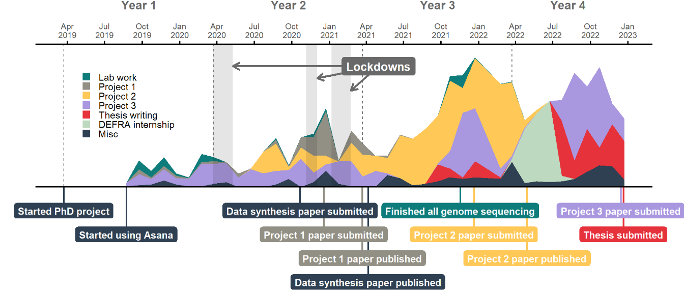
My PhD was predominantly computational, especially as the first lockdown put a quick stop to any ongoing lab work. I should clarify that the lab work tasks shown above were also tagged under the project they related to, so the teal coloured lab areas effectively duplicate some of the area below them.
The three lockdowns don’t look to have had major impact on my productivity – I had fortunately already generated enough data to be able to switch my focus to analyses when the first lockdown started. There was a bit of a drop during the third lockdown, although I think this lull was more likely due to the fact that I was waiting for reviews on two papers at the time.
My Misc category included a range of things that I worked on which didn’t connect directly to my own PhD research, such as outreach activities or other collaborations. You can see that I did more of these as my PhD went on, which feels like a natural development as I established myself in research and more opportunities came my way.
I started pulling all my work together into a thesis around the middle of the third year of my PhD, but really started working on it in earnest about six months before my deadline. This was following a three month ‘break’ during which I did an internship with the civil service and didn’t work on my PhD at all, which was a nice breather before the final strait.
Looking at my weekly activity by recreating the GitHub contributions plot
I wanted to have a go at recreating the contributions plot that you see
on GitHub profiles. The plot itself proved
relatively straightforward, but wrangling dates into week groups that
didn’t overlap between academic years required me to write a bit of a
bodge of a function (I won’t get into the
idiosyncracies of the
week and isoweek functions here!).
I also wanted to see what days I wasn’t meant to be working at all, whether they were bank holidays or days I’d actively taken off, and so I trawled through my calendar to figure out what dates I’d taken off.
#Make dummy dataframe of all dates for the period
dummy.df <- data.frame(
  date=seq(as.Date("2019-03-23"),
           as.Date("2022-12-23"), by="days"),
  weekday=weekdays(seq(as.Date("2019-03-23"),
                       as.Date("2022-12-23"), by="days")),
  week=NA,
  academic.year=NA,
  tasks=NA,
  day.off=NA
)

dummy.df$academic.year[dummy.df$date >= years.df$start[4]] <- "Year 4"
dummy.df$academic.year[dummy.df$date < years.df$start[4]] <- "Year 3"
dummy.df$academic.year[dummy.df$date < years.df$start[3]] <- "Year 2"
dummy.df$academic.year[dummy.df$date < years.df$start[2]] <- "Year 1"

#Make function to assign week numbers for each academic year to the dataframe
week_numbers <- function(dates) {

  week.numbers <- vector(length=length(dates))
  week.counter <- 1

  for (i in 1:length(dates)) {

    date <- dates[i]

    #Add 1 to counter for every new week (starting on Monday)
    if (weekdays(date) == "Monday") {

      week.counter <- week.counter + 1

    }

    #Reset counter for new academic year
    if (month(date) == 3 & day(date) == 23) {

      week.counter <- 1

    }

    week.numbers[i] <- week.counter

  }

  return(week.numbers)

}

dummy.df$week <- week_numbers(dummy.df$date)

#Make dataframe summarising number of tasks produced each day of the PhD
weeks.df <- all.tasks.df %>%
  #Make sure only completed tasks are included
  filter(!is.na(Completed.Date)) %>%
  #Pull date of task completion
  select(c("Completed.Date")) %>%
  #Add field showing each row equals one task
  mutate(tasks=1) %>%
  #Merge the real task data with the dummy data
  full_join(y=dummy.df, by=c("Completed.Date"="date")) %>%
  #Group by year/week/day
  group_by(week, weekday, academic.year) %>%
  #Add together number of tasks
  summarise(n=sum(tasks.x)) %>%
  #Order weekdays
  mutate(
    weekday=factor(weekday,
                   levels=rev(c("Monday", "Tuesday", "Wednesday", "Thursday",
                                "Friday", "Saturday", "Sunday")))
  ) %>%
  #Sort dataframe
  arrange(academic.year, week, weekday)

#Make dataframe with dates taken as holidays
holidays.df <- data.frame(
  start=c(as.Date("2019-06-20"), as.Date("2019-08-21"),
          as.Date("2019-12-19"), as.Date("2020-06-15"),
          as.Date("2020-08-24"), as.Date("2020-09-17"),
          as.Date("2020-12-21"), as.Date("2021-04-26"),
          as.Date("2021-07-19"), as.Date("2021-08-06"),
          as.Date("2021-10-15"), as.Date("2021-12-21"),
          as.Date("2022-03-24"), as.Date("2022-04-22"),
          as.Date("2022-06-17"), as.Date("2022-06-24"),
          as.Date("2022-07-16"), as.Date("2022-08-25"),
          as.Date("2022-11-25"), as.Date("2022-12-16"),
          as.Date("2022-12-22")),
  end=c(as.Date("2019-06-23"), as.Date("2019-08-23"),
        as.Date("2020-01-07"), as.Date("2020-06-16"),
        as.Date("2020-08-30"), as.Date("2020-09-22"),
        as.Date("2021-01-05"), as.Date("2021-04-30"),
        as.Date("2021-07-23"), as.Date("2021-08-09"),
        as.Date("2021-10-18"), as.Date("2022-01-23"),
        as.Date("2022-03-25"), as.Date("2022-04-22"),
        as.Date("2022-06-17"), as.Date("2022-06-24"),
        as.Date("2022-07-30"), as.Date("2022-08-29"),
        as.Date("2022-11-27"), as.Date("2022-12-16"),
        as.Date("2022-12-23"))
)

#Make dataframe with dates of English bank holidays within my start and end dates
bankholidays.df <- data.frame(
  date=c(as.Date("2019-04-19"), as.Date("2019-04-22"),
         as.Date("2019-05-06"), as.Date("2019-05-27"),
         as.Date("2019-08-26"), as.Date("2019-12-25"),
         as.Date("2019-12-26"), as.Date("2020-01-01"),
         as.Date("2020-04-10"), as.Date("2020-04-13"),
         as.Date("2020-05-08"), as.Date("2020-05-25"),
         as.Date("2020-08-31"), as.Date("2020-12-25"),
         as.Date("2020-12-28"), as.Date("2021-01-01"),
         as.Date("2021-04-02"), as.Date("2021-04-05"),
         as.Date("2021-05-03"), as.Date("2021-05-31"),
         as.Date("2021-08-30"), as.Date("2021-12-27"),
         as.Date("2021-12-28"), as.Date("2022-01-03"),
         as.Date("2022-04-15"), as.Date("2022-04-18"),
         as.Date("2022-05-02"), as.Date("2022-06-02"),
         as.Date("2022-06-03"), as.Date("2022-08-29"))
)

#Combine the holiday and bank holiday dataframes
daysoff.df <- rbind(holidays.df,
                    data.frame(start=bankholidays.df$date,
                               end=bankholidays.df$date))

#Make dataframe showing which days were days off
daysoff.weekdays.df <- unique.data.frame(
  data.frame(date=do.call("c", apply(daysoff.df, 1, function(x) seq(ymd(x[1]), ymd(x[2]), 1))),
             day.off="Y") %>%
    #Merge the days off data with the dummy data to get correct week numbers
    full_join(y=dummy.df, by=c("date"="date")) %>%
    #Filter for days off
    filter(day.off.x == "Y") %>%
    #Filter out weekends
    filter(!weekday %in% c("Saturday", "Sunday"))
)

#Plot GitHub style grid of number of tasks across all weeks of the PhD
gg.weeks.grid <- ggplot(weeks.df, aes(x=week, y=weekday, fill=n)) +
  facet_wrap(~academic.year, ncol=1) +
  geom_tile(color="white", lwd=0.8) +
  geom_point(data=daysoff.weekdays.df,
             aes(x=week, y=weekday, shape=7),
             size=2.5,
             stroke=0.6,
             colour="dimgrey",
             inherit.aes=FALSE) +
  geom_segment(data=data.frame(academic.year="Year 1"),
               aes(y=8, yend=5.5, x=18, xend=20.5),
               colour="dimgrey",
               arrow=arrow(type="open", length=unit(0.2, "cm")),
               size=0.7,
               inherit.aes=FALSE) +
  geom_label(data=data.frame(academic.year="Year 1"),
             aes(x=14, y=8.5, label="Started using Asana"),
             fill="dimgrey",
             size=3,
             fontface="bold",
             label.size=0,
             colour="white") +
  scale_x_continuous(expand=c(0, 0)) +
  scale_fill_steps(low="#9be9a8", high="#216e39",
                   na.value="#ebedf0",
                   n.breaks=5,
                   labels=c("Less     ", "", "     More")) +
  scale_shape_identity(label="= Day off",
                       guide="legend") +
  guides(fill=guide_bins(direction="horizontal",
                         axis=FALSE,
                         keywidth=unit(10, "pt"),
                         keyheight=unit(10, "pt"))) +
  coord_fixed(clip="off", ylim=c(1, 7)) +
  ggtitle("I generally managed to avoid working on weekends or days off") +
  theme_minimal() +
  theme(legend.title=element_blank(),
        legend.position=c(0.85, 0.1),
        legend.text=element_text(size=8),
        legend.spacing.y=unit(0.5, "pt"),
        plot.title=element_text(face="bold", hjust=0.5),
        plot.title.position="plot",
        strip.text=element_text(face="bold", colour="dimgrey"),
        axis.title=element_blank(),
        axis.text.y=element_text(size=6),
        axis.text.x=element_blank(),
        axis.ticks=element_blank(),
        panel.grid=element_blank(),
        plot.margin=margin(0, 0, 0, 0)) +
  ggpreview(width=7, height=5, units="in")

You can see things generally ramping up across the academic years, although I’m sure there was also an element of my task management improving with time. You can also easily see how sacred weekends are to me!
The distribution of days off throughout the year looks pretty reasonable but perhaps a little sparse, so I also checked how many days I actively took off each year.
#Calculate the average number of days taken off per year, excluding bank holidays
daysoff.sum.df <- unique.data.frame(
  data.frame(
    date=do.call("c", apply(holidays.df, 1, function(x) seq(ymd(x[1]), ymd(x[2]), 1))),
    day.off="Y"
  ) %>%
    #Merge the days off data with the dummy data to get correct week numbers
    full_join(y=dummy.df, by=c("date"="date")) %>%
    #Filter for days off
    filter(day.off.x == "Y") %>%
    #Filter out weekends
    filter(!weekday %in% c("Saturday", "Sunday")) %>%
    #Filter out overlaps with bank holidays
    filter(!date %in% bankholidays.df$date)
) %>%
  #Summarise number of days off taken each year
  group_by(academic.year) %>%
  count()

#Plot barplot of days off per year
gg.daysoff <- ggplot(daysoff.sum.df, aes(x=academic.year, y=n)) +
  geom_col() +
  geom_text(aes(label=n),
            #size=3,
            colour="white",
            face="bold",
            position=position_stack(vjust=0.5)) +
  ggtitle("The number of days I took off\nvaried a lot across years") +
  theme_minimal() +
  theme(axis.title=element_blank(),
        axis.text.y=element_blank(),
        plot.title=element_text(face="bold", hjust=0.5),
        plot.title.position="plot",
        panel.grid=element_blank()) +
  ggpreview(width=3, height=3, units="in")
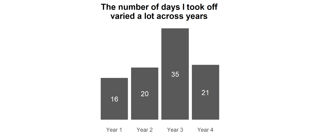
Note that Year 4 was 9 months rather than a full 12, so is not directly comparable to the other years. Nonetheless, you can see that in the first couple of years of my PhD I erred on the side of not taking as much time off as I probably should (i.e., how much I would be entitled to for most jobs in the UK).
This is something I became aware of at the time, and so I started making more of a conscious effort to take days off. This led to me taking a really big holiday in Winter 2021-2022, which was timely as it followed a pretty intense period of work towards submitting the biggest paper of my PhD and I was pretty burnt out. Across all four years (and accounting for Year 4 being 3/4 the length of the other years) I took an average of 24.75 days off a year, so basically on par with a typical annual leave allowance for many UK jobs.
The fact that I could take more time off one year to compensate for not taking much in other years is a testament to the flexibility of working in academia. It also meant that I could do some more ambitious travelling that I might otherwise find difficult to get the time to do in a ‘normal’ job.
Clock plot of working hours
I did well at not working on weekends or holidays, but what about my daily work hours? One of the great things about academia is that you can generally organise your own time, but if you’re not careful this can end up with work hours bleeding into your personal time.
#Fix time zones for period I was abroad
all.tasks.df$Completed.At.Local <-
  ifelse(as.Date(all.tasks.df$Completed.At) >= as.Date("2021-12-16") &
           as.Date(all.tasks.df$Completed.At) <= as.Date("2022-01-23"),
         format(as_datetime(all.tasks.df$Completed.At),
                tz="America/New_York", usetz=TRUE),
         format(as_datetime(all.tasks.df$Completed.At),
                tz="Europe/London", usetz=TRUE))

#Add field with hour when tasks were completed
all.tasks.df$hour <- hour(all.tasks.df$Completed.At.Local)

#Make vector for label colouring depending on whether any tasks were completed in that hour or not
hour.colours <-
  ifelse(seq(0, 23) %in% seq(0, 23)[
    !seq(0, 23) %in% all.tasks.df$hour
  ],
  "grey", "black")

gg.hours <- ggplot(all.tasks.df, aes(x=hour)) +
  geom_col(data=data.frame(x=seq(-0.5, 23.5),
                           y=max(table(all.tasks.df$hour))),
           aes(x=x, y=y),
           fill="grey94",
           colour="white",
           width=1) +
  geom_histogram(breaks=seq(0, 23),
                 colour="white") +
  coord_polar(start=0) +
  scale_x_continuous(limits=c(0, 24),
                     breaks=seq(0, 23),
                     labels=paste0(str_pad(seq(0, 23), pad="0", width=2),
                                   ":00")) +
  ggtitle("I generally worked a standard 9 to 5") +
  theme_void() +
  theme(axis.title=element_blank(),
        axis.text.y=element_blank(),
        axis.text.x=element_text(
          colour=hour.colours,
          angle=c((90 - 360 / 24 * c(0:12)),
                  (-90 - 360 / 24 * c(13:24))),
          size=8
        ),
        plot.title=element_text(face="bold", hjust=0.5),
        plot.title.position="plot",
        plot.margin=margin(0, 0, 0, 0)) +
  ggpreview(width=4, height=4, units="in")
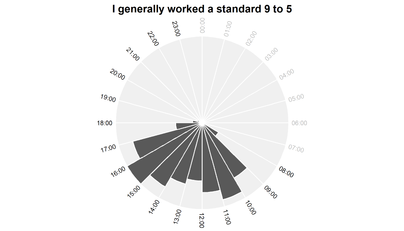
Despite having the freedom to manage my own time, I generally kept to a typical 9 to 5 workday. This is no surprise to me – I made a conscious decision when I started to treat my PhD like a job (which PhDs definitely are, but let’s not get into that whole discussion). I’m pretty disciplined so I managed to stick to that routine, although in a very small number of cases I worked up to midnight – I know that these were mostly late nights to get papers submitted!
Although there’s slightly more activity in the afternoon than the morning, I’m honestly quite surprised how productive I seem to have been early in the day considering that I am decidedly not a morning person and certainly not an early riser by choice. Since the start of the pandemic when I shifted to predominantly working from home (yay) I’ve become worse at taking a proper lunch break (boo), which is reflected by the fact that there’s not much of a drop in number of tasks between 12:00 and 14:00.
Distribution of task size
Not all tasks are made equal – there’s a massive difference, for instance, between ‘email supervisor to set up meeting’ and ‘do statistical analyses’. To get an idea of the size of most of my tasks, I plotted a histogram of the number of days it took for me to complete tasks.
#Make dataframe summarising how long tasks took
tasklength.df <- all.tasks.df %>%
  #Add field with length in days between when tasks were made and completed
  mutate(length=difftime(all.tasks.df$Completed.Date,
                         all.tasks.df$Created.Date, units="days")) %>%
  #Summarise frequency of tasks for each length
  group_by(length) %>%
  summarise(num=n()) %>%
  #Filter for top 10
  filter(length < 11)

#Model for negative exponential curve
fm0 <- nls(log(tasklength.df$num) ~ log(a*exp(b*as.numeric(tasklength.df$length))),
           tasklength.df, start=c(a=1, b=1))

#Plot barplot of task lengths
gg.tasklength <- ggplot(tasklength.df, aes(x=length, y=num)) +
  geom_bar(stat="identity", fill="lightgrey") +
  stat_smooth(method="nls", formula=y ~ a*exp(b*x), se=FALSE,
              method.args=list(start=coef(fm0)),
              colour="dimgrey") +
  ggplot2::annotate("segment",
                    x=7,
                    xend=10,
                    yend=750,
                    y=750,
                    arrow=arrow(type="open", length=unit(0.2, "cm")),
                    colour="dimgrey",
                    size=1) +
  ggplot2::annotate("label",
                    x=7,
                    y=750,
                    label=paste(
                      "My longest task took me\n",
                      all.tasks.df %>%
                        mutate(length=difftime(
                          all.tasks.df$Completed.Date,
                          all.tasks.df$Created.Date,
                          units="days")
                        ) %>%
                        slice(which.max(length)) %>%
                        pull(length),
                      "days to get round to..!"
                    ),
                    fill="dimgrey",
                    label.size=0,
                    colour="white") +
  scale_x_continuous(breaks=c(0:10),
                     labels=c("<1", 1:10)) +
  scale_y_continuous(expand=c(0, 0)) +
  labs(x="Number of days taken for a task", y=NULL,
       title="I broke most work down into tasks that could be completed in less than a day") +
  theme_minimal() +
  theme(legend.title=element_blank(),
        legend.position="none",
        plot.title=element_text(face="bold", hjust=0.5),
        plot.title.position="plot",
        axis.text.y=element_blank(),
        axis.ticks.x=element_line(),
        axis.line.x=element_line(),
        panel.grid=element_blank()) +
  ggpreview(width=7, height=3, units="in")

You can see that I broke almost everything down into something that could be completed within a day, or at least the next day. So instead of ‘do statistical analysis’, I’d probably have ‘research methods’, ‘read tutorial’, ‘install R packages’ etc.
This is a widely accepted trick for boosting motivation and I find it really helps to make even the slowest or hardest days feel productive. There’s nothing like that dopamine hit from marking something as complete on my to-do list!
That said, it did amuse me that there was something which I avoided for an impressive 467 days. If you’re curious, it was uploading some of my sequencing data onto the HPC I was using for analysis (which is about as tedious as it sounds, hence the delay!)
Wordcloud of my PhD tasks
What actually were my tasks? The quickest and easiest way to see is probably as a wordcloud, but I’ll say that my approach to clean my text data was undoubtedly not the most efficient and I’m sure there are better alternatives out there.
library(tm)

#Make corpus object of all task descriptions
words.corpus <- Corpus(VectorSource(all.tasks.df$Name))

#Clean word data
words.corpus.cleaned <- words.corpus %>%
  #Remove numbers
  tm_map(removeNumbers) %>%
  #Make all lowercase
  tm_map(content_transformer(tolower)) %>%
  #Remove punctuation
  tm_map(removePunctuation) %>%
  #Remove whitespace
  tm_map(stripWhitespace) %>%
  #Remove English conjunctions
  tm_map(removeWords, stopwords("english")) %>%
  #Remove some specific non-meaningful words I don't want included
  tm_map(removeWords, c("non", "etc", "bas", "fel"))

#Convert to matrix
words.cleaned.mat <- as.matrix(DocumentTermMatrix(words.corpus.cleaned))
#Convert to dataframe
words.cleaned.df <- data.frame(word=colnames(words.cleaned.mat),
                               freq=colSums(words.cleaned.mat))
#Filter for words that appear more than once
words.cleaned.df <- words.cleaned.df[words.cleaned.df$freq > 1,]

#Vector of words that appear as both singular and plural
singular <- c("slide", "endophyte", "month", "accession",
              "abbreviation", "colour", "annotation", "plate",
              "size", "name", "contig", "link", "consignment",
              "gap", "candidate", "file", "codon", "paper",
              "script", "cazyme", "sample", "protein", "endophyte",
              "orthogroup", "effector", "culture", "correlation",
              "gene", "comment", "genome", "plot", "reference",
              "otu", "lifestyle", "tree", "figure", "csep",
              "extraction", "alignment", "sequence", "strain",
              "citation", "pest", "reviewer", "order", "tool",
              "detail", "form", "question", "comparison", "est",
              "unit", "resource", "count", "duplicate", "region",
              "programme", "site", "rate", "determinant",
              "boxplot", "acronym", "isolate", "protocol",
              "endemic", "legend", "result", "method", "label",
              "table", "italic", "edit", "number", "package",
              "note", "phylogenomic", "test", "line", "busco",
              "ilia", "node", "letter", "bit", "list", "caption",
              "column", "type", "biosample", "tag", "word",
              "bracket", "contaminant", "phylogenetic", "bead",
              "cell", "genomic", "transcript", "section",
              "bioinformatic", "id", "comma", "import", "version",
              "arrow", "document", "value", "need", "model",
              "marker", "estimation", "amy", "hit", "outlier",
              "clade", "length", "distribution", "email",
              "revision", "euler", "asterisk", "blast", "pcwde",
              "step", "filename", "histogram", "point", "peptide",
              "ending", "linebreak", "publication", "habitat",
              "classification", "compound", "highlight", "sh",
              "fig", "phenotype", "error", "group", "photo",
              "richard", "ester", "simon", "coauthor", "location",
              "facet", "difference", "chapter", "footnote")

#Correct plurals to singular
for (i in singular) {

  if (paste0(i, "s") %in% words.cleaned.df$word) {

    words.cleaned.df$freq[words.cleaned.df$word == i] <-
      words.cleaned.df$freq[words.cleaned.df$word == i] +
      words.cleaned.df$freq[words.cleaned.df$word == paste0(i, "s")]

    words.cleaned.df <- words.cleaned.df[-which(words.cleaned.df$word == paste0(i, "s")),]

  }

}

#Make a dataframe of more complex plurals/abbreviations to convert
replace.df <- data.frame(old=c("fig", "assemblies", "families",
                               "countries", "branches", "stats",
                               "boxes", "classes", "categories",
                               "topologies", "refs", "rshiny",
                               "fus", "fusotu","fusaria"),
                         new=c("figure", "assembly", "family",
                               "country", "branch", "statistics",
                               "box", "class", "category",
                               "topology", "reference", "shiny",
                               "fusarium", "fusarium", "fusarium"))

#Correct plurals to singular
for (i in 1:nrow(replace.df)) {

  words.cleaned.df$freq[words.cleaned.df$word == replace.df$new[i]] <-
    words.cleaned.df$freq[words.cleaned.df$word == replace.df$new[i]] +
    words.cleaned.df$freq[words.cleaned.df$word == replace.df$old[i]]

  words.cleaned.df <- words.cleaned.df[-which(words.cleaned.df$word == replace.df$old[i]),]

}

#Order by frequency
words.cleaned.df <- words.cleaned.df %>%
  arrange(desc(freq))

library(png)
library(ggwordcloud)

set.seed(2)

#Plot wordcloud
gg.wordcloud <- ggplot(words.cleaned.df, aes(label=word, size=freq)) +
  geom_text_wordcloud_area(
    mask=readPNG("mushroom.png"),
    rm_outside=TRUE) +
  scale_size_area(max_size=20) +
  theme_minimal() +
  theme(plot.margin=margin(0, 0, 0, 0)) +
  ggpreview(width=7, height=4, units="in")
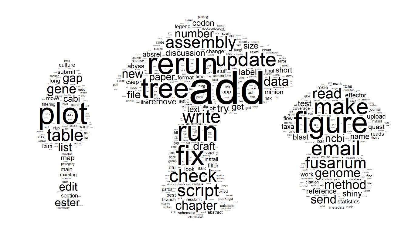
I like that some of my most used words epitomise what it’s like to do research – I was constantly rerunning, adding to and fixing things.
Tree (i.e., phylogenetic), assembly (i.e., genome) and Fusarium look to be my biggest field-specific topics, which is a pretty accurate summary of the content of my PhD thesis.
Take-home
Based on the data of all my daily tasks recorded on Asana, I found that I generally had a pretty consistent routine throughout my PhD and kept strict boundaries separating work and non-work.
All of this comes with the huge caveat that, compared to many, I had a simple time of it – I didn’t have to do part-time work on top of my PhD as it was fully funded; I had a strong support network in my partner, friends and family; I didn’t have any caring responsibilities; and I was generally healthy. Doing a PhD can be a pretty crazy endeavor and like anybody I had my ups and downs with mental health, but nothing that I was not able to ultimately manage. I am very grateful for all these things and know that they have positively impacted my productivity.
I’m proud of everything I got done during my PhD, but I’m also really pleased that I managed to do it without sacrificing my whole life. I’m sure it helped my productivity to have been disciplined about my schedule, and that maintaining distinct work and non-work time allowed me to be more focused and efficient in work hours.
Session details
sessionInfo()
## R version 4.1.2 (2021-11-01)
## Platform: x86_64-w64-mingw32/x64 (64-bit)
## Running under: Windows 10 x64 (build 19044)
##
## Matrix products: default
##
## locale:
## [1] LC_COLLATE=English_United Kingdom.1252
## [2] LC_CTYPE=English_United Kingdom.1252
## [3] LC_MONETARY=English_United Kingdom.1252
## [4] LC_NUMERIC=C
## [5] LC_TIME=English_United Kingdom.1252
##
## attached base packages:
## [1] stats     graphics  grDevices utils     datasets  methods   base
##
## other attached packages:
##  [1] ggwordcloud_0.5.0 png_0.1-7         tm_0.7-8          NLP_0.2-1
##  [5] tgutil_0.1.14     patchwork_1.1.1   lubridate_1.8.0   forcats_0.5.1
##  [9] stringr_1.4.0     dplyr_1.0.8       purrr_0.3.4       readr_2.1.2
## [13] tidyr_1.2.0       tibble_3.1.6      ggplot2_3.4.0     tidyverse_1.3.2
## [17] asana_0.1.1
##
## loaded via a namespace (and not attached):
##  [1] httr_1.4.2                 jsonlite_1.8.0
##  [3] splines_4.1.2              modelr_0.1.8
##  [5] assertthat_0.2.1           highr_0.9
##  [7] googlesheets4_1.0.0        cellranger_1.1.0
##  [9] slam_0.1-50                yaml_2.3.5
## [11] pillar_1.7.0               backports_1.4.1
## [13] lattice_0.20-45            glue_1.6.2
## [15] digest_0.6.29              assertive.types_0.0-3
## [17] rvest_1.0.2                colorspace_2.0-3
## [19] htmltools_0.5.2            Matrix_1.3-4
## [21] pkgconfig_2.0.3            broom_0.7.12
## [23] assertive.properties_0.0-4 haven_2.5.0
## [25] scales_1.2.1               tzdb_0.3.0
## [27] googledrive_2.0.0          mgcv_1.8-38
## [29] generics_0.1.2             farver_2.1.0
## [31] ellipsis_0.3.2             withr_2.5.0
## [33] cli_3.2.0                  magrittr_2.0.2
## [35] crayon_1.5.0               readxl_1.4.0
## [37] evaluate_0.15              fs_1.5.2
## [39] fansi_1.0.2                nlme_3.1-153
## [41] xml2_1.3.3                 tools_4.1.2
## [43] hms_1.1.1                  gargle_1.2.0
## [45] lifecycle_1.0.3            munsell_0.5.0
## [47] reprex_2.0.1               compiler_4.1.2
## [49] rlang_1.0.6                grid_4.1.2
## [51] rstudioapi_0.13            assertive.base_0.0-9
## [53] labeling_0.4.2             rmarkdown_2.14
## [55] gtable_0.3.0               codetools_0.2-18
## [57] DBI_1.1.2                  curl_4.3.2
## [59] R6_2.5.1                   knitr_1.37
## [61] fastmap_1.1.0              utf8_1.2.2
## [63] stringi_1.7.6              parallel_4.1.2
## [65] Rcpp_1.0.8                 vctrs_0.5.1
## [67] dbplyr_2.1.1               tidyselect_1.1.2
## [69] xfun_0.30